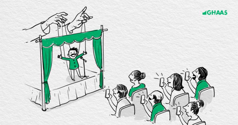
There is no single accurate definition of a perfect logo. But the closest anyone has ever come to explaining how a logo should be is Sagi Haviv. The New Yorker, Sagi Haviv, is often referred to as a “logo prodigy”. A partner in the firm Chermayeff & Geismar & Haviv, Sagi can be credited the logo designs for National Geography, Harvard University Press, US Open Tennis Championships, Mobil, CNB and many more.
According to him, a logo must have three attributes:

Three Attributes Of A Logo: Sagi Haviv
A Logo Should Be Appropriate
A logo should be appropriate for the brand it represents. It should aptly convey what the brand stands for such that the brand can be identified through it. However, many designers often misinterpret this as the logo to be expressive. That is not the case.
A logo is an identification tool for the brand. Its purpose is not communication. It doesn’t have to say too much.
A Logo Should Be Distinctive/Memorable
A logo should be distinct and unusual enough to leave a mark. The image should persist in the mind of the consumer such that if the person comes across the logo again, it can recollect the memory and thereby connect the logo to the brand it represents.
A Logo Should Be Simple
Designers often go over the top trying to make the logo too elaborate. While it is imperative to have a distinctive logo, one should not complicate the design beyond a point. It should be simple for the consumer to understand and connect with.
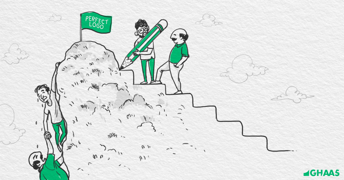
How To Create The Perfect Logo?
A designer is often faced with a lot of questions while creating the perfect logo design. Some of them are:
- How can I reduce the number of iterations I get from the client on my logo?
- Why is it so hard to get approval from the client?
- What is the best way to achieve the client’s goal and position them aptly?
I also often encounter similar questions. So, I began researching on logo designing. I read about the history of logo designing and the psychology that is at play when it comes to logos. Based on my research and personal experience, and the insights I gained from “The Futur” (Emmy Award-winning director, designer, strategist and educator, Chris Doe’s Youtube channel), I learnt that building a process around logo creation is a must.
And this is what I came up with. Here’s the 10-step process I follow while designing any logo:
Step 1: Ask The Right Questions
To be able to answer the questions you face, you must first ask the right questions to the client.
Your aim should be to get as much clarity on the brand and their expectations as possible. Always remember, “The more you ask, the more you know.”

I came across an amazing book, “Brand Gap” by Marty Neumeier. Often known as the master storyteller, Marty is an American author popular for his writings on the subjects of brand, design, innovation, and creativity. Presently the CEO of Branding for Liquid Agency, Marty explains that all brands are based on three core questions:
- Who are you?
- What do you do?
- Why does it matter?
Apart from these, I also add questions pertaining to brand value, positioning and audience. Through these, you get clarity on what they stand for and what they expect.
Step 2: Prepare The Brand Essence
Based on the responses from the client on the preliminary questions, prepare a brief about the brand and its vision, thereby getting clarity on the brand persona.
Step 3: Note The Keywords
Using the brief, extract a set of keywords defining the brand. This helps in building a visual language for the brand using the tangible and intangible selling points of the brand.
Step 4: Prepare A Mind Map
Convert your keywords into a mind map. This refers to organising those keywords visually to show hierarchy and relationships and bring out the bigger picture.
Step 5: Create The Mood board/Stylescape
Finally, reveal the brand stylescape which is essentially a collection of brand assets such as colours, typography, photography, patterns, etc. that are combined together to build the visual aesthetic of the brand.
Step 6: Think Of A Design Concept
On the basis of the mood board and keywords, come up with the actual design concept. More often not, try to build the concept around your brand values. Clients are more likely to prefer that and it serves as a perfect identification tool for the brand.
Step 7: Build A Brandmark/ Wordmark
Once the concept is in place, you need to come up with brand marks/Wordmarks which are visual images, elements or symbols that would identify the brand and contribute to building and maintaining the brand image. For example, the Nike swoosh symbol.

Step 8: Lockup Your Logo
Add a Wordmark to your Brandmark to complete your logo lockup. This includes typeface and font for the logo as well. For Example, the Nike Swoosh mark along with the word Nike.
Step 9: Add The Colors
Add colour to your creation, thereby defining the brand colours. Remember, the colours you choose must have a logical backing behind them and should add value to the design.
Step 10: Execute The Design
Prepare a series of collaterals (mockups) with the logo on them to show its scalability and usability on different products, media, and channels.
In The End
I’d like to sum this up by quoting the legendary American art director and graphic designer, best known for his corporate logo designs, Paul Rand.
“A logo derives its meaning from the quality of the thing it symbolizes, not the other way around. A logo is less important than the product it signifies; what it means is more important than what it looks like.“