Suppose, you have a website, a landing page, an e-commerce website, or just a blog.
Either way, it has a purpose — either to sell a product, a service or you want people to subscribe to your mailing list.
But, things aren’t working out as you had planned.
You open Google Analytics, and you see that people are visiting your website, but they aren’t doing what they are supposed to — at least not what you want them to do.
Even if some of them do convert, they’re not coming back. Your website didn’t create much of an impact in their minds that they would come back.
If you put consistent effort into improving the user experience of your website and everything that goes with it, you can turn things around and improve your conversions.
This is what I’ll cover in this post:
- What is User Experience?
- The Importance of Improving the User Experience of a Website
- 8 Tactics to Improve Your Website’s User Experience
What is User Experience?
“User experience (UX)”, according to usability.gov, “focuses on having a deep understanding of users, what they need, what they value, their abilities, and also their limitations. It also takes into account the business goals and objectives of the group managing the project.”
In short, it’s about how we can make the experience of the visitors as meaningful and valuable as possible.
A good user experience would mean that:
- the user visited your website,
- scrolled through the different pages,
- understood what the website is all about, and
- finally, got what they wanted.
There are many factors that influence user experience which in turn can make or break your business. They are:
- Value – Does your content/product/service make their time spent on the website worthwhile?
- Usability – Is your website easy to use?
- Usefulness – Does your website satisfies users’ requirements?
- Desirable – Does your brand strike an emotional chord with the user?
- Findable – Is your website easily navigatable?
- Accessible – Can people with disabilities access your website?
- Credible – Does your brand, identity, content, and/or service builds trust and belief of the user?
The Importance of Improving the User Experience of a Website
Every step you take to improve user experience optimizes the conversion funnel.
The objective is to reduce as many obstacles as possible. Such that, the visitors don’t get stuck thinking about what is happening and how to get what they want.
Let’s say, somebody:
- Landed on your blog post.
- While consuming the content they see a sign-up form that promises exclusive content (such as downloadable ebooks).
- They sign up and are happy with the exclusive content.
- A week later, you send them an email about a 12-hour video course, that takes them to a landing page.
There are two possible outcomes of this (provided that they are interested):
- They take up the video course.
- They didn’t because of some UX thing (like an unsettling GIF) that put them off.
You see, nobody likes friction. And you don’t want people leaving your funnel because of the friction they encountered while navigating through your website.
Here’s the deal: improving user experience has a lot to do with common sense.
In other words, our goal is to minimize the mistakes that might make the people think:
“How do I contact the owner? I can’t find the contact page/number/email.”
“Ugh! This website is a mess. So cluttery.”
*click’s a button* “Hold on! That’s not a button?”
“What the heck is this website all about?”
Instead, an ideal user thought would sound like:
“Okay. These are the features. I get what the product is. There’s the pricing link on the navigation menu. And there are the plans. Got the thing that I want.”
8 Tactics to Improve Your Website’s User Experience
There are dozens of variables when it comes to optimizing user experience. From market research to usability evaluation and from user interface design to accessibility, there’s a lot that goes into this.
You see, a visitor is always on your website with a mission. Now, it’s up to us — how easy we make it for them to accomplish that mission.
However, there’s no limit to optimizing the crap out of everything on your website. But for starters, here are some tactics that you can start out to improve the user experience of your website.
1. Make use of conventions
Use conventions when it comes to websites.
Why? Because people are used to those conventions. Like how we easily recognize the stop signs on the road. Therefore, we can take advantage of this human behavior.
Some people would argue that if you don’t follow the conventions then how would you be more creative?
Totally understandable. But, when it comes to great user experience, I’d keep my creativity aligned with the thought process of the masses.
Things like:
- Logo placed on the top-left corner.
- Main navigation menu placed highest up on the page, on the right side or centered.
- Contact included in the main navigation menu.
- Call to action button at the top.
- The search feature in the header.
- Sign-up form in the footer.
- Social media links (as icons) in the footer.
- Social sharing buttons sticky on the left side of the page.
- Sitemap and various other less frequently clicked links (like Privacy Policy, Terms) placed in the footer.

2. Maintain visual and typographic hierarchies
Text in content should be easily distinguishable to increase its readability. There are usually three-four levels:
- Title (H1)
- Headings (H2)
- Sub-headings (H3)
- Paragraph/body text
Sometimes, a sub-title is also seen.

There are a few ways to establish visual hierarchy:
- Size
- Weight
- Color
- Position
- Type Contrast
The most important text is bolder, darker and/or larger. As the importance decreases, the prominence of the text also decreases.
It better to have some level of variation when it comes to heading levels.
3. Format text for the kids
When it comes to formatting text in a more user-friendly way, here are some suggestions:
Use a sans-serif font for better readability
Sans-serif fonts like Arial, Helvetica, etc., are easier to read on digital screens than serif fonts like Georgia, Times New Roman, etc.

Use plenty of headings
The truth is, most people don’t read the main content. But, some will read the headings. Also, they help break the text and make it look better organized.
Keep paragraphs short
Short paragraphs are easier to read than big blocks of text that feel like running a marathon. If you see any big paragraphs on your website — try to break them into smaller paragraphs. Ideally, two or three statements per paragraph work fine.
Use bulleted lists
- They help break large blocks of text,
- into easy to read format, and
- make key information stand out.
Feel free to use numbered lists as well.
Highlight key terms
Like I said before, most people don’t read the content. They scan the content.
So, it’s better to highlight the keywords and phrases that people are looking for. Formatting them in bold and sometimes also italicized makes them easier to find.
But remember, don’t highlight too much as it will lose its effectiveness and credibility.
4. Don’t let your website shout
Ever visited websites that look as if they’re begging for attention? I’m talking about the websites with loads of animations, colors, unnecessary clutter, disorganized content, and endless popups.
Here’s the deal:
Nobody likes a poorly designed website. And many websites easily fail in that category.
When it comes to beauty, websites aren’t that different from people, buildings, nature, animals, and monuments. People want to be around things that are aesthetically pleasing to look at.
You see, a cluttered website isn’t an aesthetic problem but a business problem. A problem that could cost you a lot of money.
If you say you are great at something or your product is awesome, then your website design should walk the talk.
Use white space
Dividing the page into clearly defined sections makes it easier to scan and focus.
You can also use different background colors, images or other design elements to define different sections.
Organize content in a logical way. The most important things come first.
If you have big blocks of content, divide them into separate sections as they are easier to grasp. Use white space, break up the page into clearly defined sections, keeping the noise down.
You don’t need too many popups
Get rid of unnecessary animations and popups that come into the way of a pleasant experience.
I’m not asking you to get rid of all popups. But, there’s a limit. Popups should notify, not annoy.
A simple, clean design always wins
When you get rid of unnecessary stuff from your web pages, you are left with a much cleaner interface.
5. If it should be clicked, make it obvious
The deal is that people are usually on your website have a mission and are always in a bit of hurry. So, they want to get what they want without wasting a single second.
And, the goals of the website are met when somebody takes action, which in our case is by clicking on a link or button. Hence, you want to make it easily noticeable and obvious.

Buttons and links look different in different browsers and operating systems. Fortunately, with the help of CSS, you can keep a consistent style for all browsers and devices.

Most importantly, a link should look like a link. So should a button.
- A link is usually underlined and colored, which changes on hover, focus and visited. Make sure the colors are set different for all of these different actions.
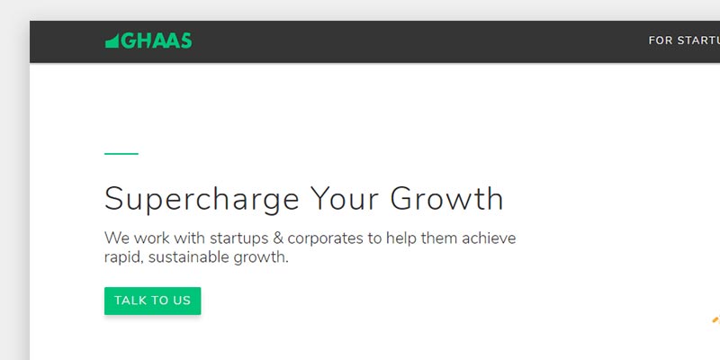
- A button can be easily identified when they have a shadow, different (darker) background color and/or bold text (sometimes uppercase). The shadow can increase and/or colors can change on hover and click.
Note: On the flip side, if an element on your website is not meant to be clicked, then it shouldn’t look like so.
6. Omit needless words
By now, you must know that people don’t read content, they scan.
So, you want to get rid of the content that is most likely going get ignored. You need to ask yourself what is it that you care about the most and what your visitors should care about the most.
Remove everything that doesn’t directly affect people’s decisions. Instead of writing a lot of content, make a habit of saying more with fewer words.
Also, you don’t want to overwhelm people with too much content. Your website should be easy to grasp.
The deal is, people are visual. For instance, they will see a YouTube video’s thumbnail before they even read the title.
Have more visual content such as:
- images,
- infographics,
- slideshows,
- videos, and even
- gifs.
Remember to not overdo it. Having a good balance of visual and textual content will:
- increase the time spent by users on the website, because the visual content is easier to understand than text,
- increase the sharability of the pages, and
- improve the user experience.
7. Tell your visitors where they are using the site navigation, the right way
When a person is browsing your website, the last thing you want for them is to get lost. The site navigation should let users know where they are and how they can get somewhere.
A website can have several navigation menus:
The main navigation
- Place it at the top right of the page.
- A must have.
- Include the most important links to the pages like home, about, contact and login/signup.
- Include the links to pages that can further help reach the goals and clear details like the products, services or resource pages.
- Have a link/button that completes the main goal like “Buy now”, “Download now”, “Contact us”.
- Order the items based on importance.
- The logo should link to the home page.
- Have the ability to search, which is very helpful in making your website more usable.
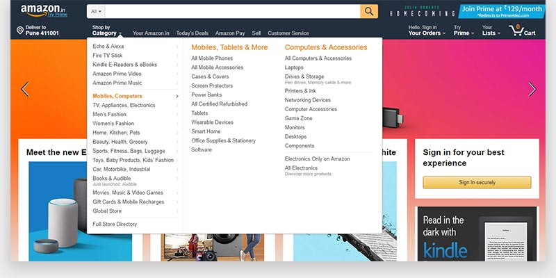
The secondary (mega) navigation
- Place it right below the main navigation.
- Large websites like eCommerce, news, blogs require this kind of navigation.
- Consists of links that help browse categories and sub-categories.
- Should have a clear hierarchal structure and be well-organized such that the parent categories are connected to the children. All links should be clickable.

The footer navigation
- Resides in the footer.
- A must have.
- Consists of the website sitemap, contact information, social media links, and links to legal pages.
- The “Back to top” link/button is recommended.
Also, indicate where you are. The current page should be highlighted on the navigation bar.

Mobile navigation
With mobile screens, you have limited space. Which means, you can’t display your navigation menus like the way you do on bigger screens.
What you can do instead is — on the navigation bar — include a hamburger icon that opens a drawer with all your designs. This can be achieved with a responsive-design (will get on that in a moment).

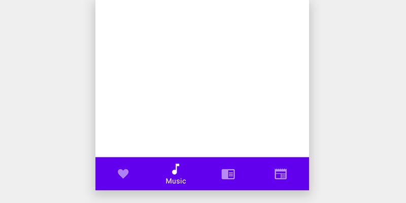
There are other variations as well — to how you want to display the navigation. For example,
1. Bottom navigation bar

2. Tabs

You can use one of these in combination with the drawer as well.
Also, make sure that the buttons and links are big enough for a normal human thumb to press easily.
8. Optimize website performance, for a smooth user experience
Not only the design and content of the website are important, how your website is developed and maintained are equally significant.
Good website performance helps improve:
- User experience, obviously
- Search engine optimization
- Reaching your conversion goals
A well-optimized website simply means more money.
Optimize website speed/load times
Website page loads times are critical when it comes to user experience. You don’t want people with slow internet connections to wait for the images to load.
Why? Because each extra second it takes to load your website, you lose people.
Although, this is post is not about techniques to optimize page load speed, here are some recommendations:
- Optimize your images. They contribute the most in downloading webpage assets. Reduce the file size as much as possible without losing quality.
- Minify scripts and stylesheets.
- Use a Content Delivery Network (CDN) and cache website resources.
- Get rid of unnecessary assets/features that slow down the speed and frustrates the browsing experience.
These are some methods, but there’s a lot more to it. There are many tools for testing your website speed. Start with GTmetrix or Google’s web.dev.
These tools will give you recommendations on how to improve the website speed.
Responsive and mobile-friendly design
We live in a multi-screen world. This is great.
But, when it comes to websites, we have to make sure that our website looks great on all of these screen sizes. That’s why it is important to make your website responsive.

Responsive design helps solve many problems.
- It adapts to the screen size.
- It improves the user experience.
- It is cost effective.
- It is easier to code. Hence, easier to manage.
You can check whether your website is responsive by resizing your browser size. Your website should automatically adapt itself.
Connecting The Dots
There you have it. The basics to improve your website’s user experience.
Remember, these are only the basics. The next step would be to start analyzing how people are visiting your website and what they are doing on it.
Do A/B (split) testing: test different variations of the same page (change text, colors, organization, etc.). While doing so, you’ll figure which variation works better and how you can further improve.
If you want to continually do well, you need to start optimizing your website, keep testing and see what works the best.


